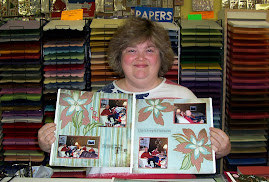
This is another layout from the Scrapbook & Card Buffet last Saturday!
It has a very interesting history. Someone on SCS saw it in an advertisement. I can't remember what it was originally, but they created something similar to the border on the right-hand side to turn into a card front. When I saw it, I thought it'd be perfect for a border on a scrapbook page!

This side of the page is cased from a page in a scrapbook magazine that uses printed paper. I can't remember which magazine it was, but when I saw it, I just knew I could alter it to be the left-hand side of this layout.
I left the big black space at the top for my title. I'm thinking of a retro-styled Sizzlit font cut out of the Whisper White cardstock. Some of the people at the buffet made extra circles in each color and put them on the Green Galore strip at the top on the left-hand side for balance. That looked really nice, too.

When I posted this layout on SCS yesterday, someone commented that it would be awesome for layouts of people playing pool! I hadn't even thought of that, but I can definitely see how it'd work.
Making the white circles off center was a big challenge for me. Someone at the Buffet said they looked like olives, and I agree that olives or pool balls are very good descriptions. I'm such a symmetrical person I always want to line things up perfectly, so it was hard not to put the white dots in the center of each circle. But I have to admit that I love how they look with the circle placed near the edge.
Now I just need some cute pictures to go on these pages!


No comments:
Post a Comment