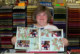
This layout is based on a scrap map by Heather Summers, a Canadian SU! demo. I had so much fun using the SAB Designer Series Paper, Certainly Celery Ribbon, and Polka Dot Punches stamps on this layout. This DSP was designed to match the stamps, so everything is super easy to coordinate!

This page will hold 4 photos. I used my new Sizzix Billboard Alphabet Strip to make my title, IMPROV. I love the subtle white stitching on the DSP. It looks tons better in real life!

For some reason, the letters didn't show up as well in the photo of this page, but I used the same alphabet for my sub title, Instant Challenges. This page will hold three photos or two photos and journaling.
Wait until you see SAB Layout #3 tomorrow! I used more of the SAB products, including the So Saffron ribbon, and one of my new SU! exclusive Sizzix Dies. I can't wait to share what I came up with!


No comments:
Post a Comment